Kitchen Decor Habits That Cheapen the Room Fast
Most tacky kitchens are not accidents. They are the sum of small, well-meaning choices: a fake fern here, a slogan print there, a counter buried under clutter.
The same mistakes show up on repeat.
This guide walks through the habits worth dropping, what to do instead, and why the fix matters for how the room reads and functions...
1. Faux Fruit and Plastic Greenery
Artificial fruit bowls and plastic stems fool almost no one, and they turn into dust magnets. The staged realism never lands. Even premium versions read as what they are.
Even the good faux plants and fake fruit still read as fake. The position is firm: either have real plants and real fruit, or nothing at all.
Instead: real produce or one sculptural piece.
Swap the bowl of waxy pears for in-season fruit, a live herb in a pot, or one sculptural ceramic object. Each earns its place and none needs dusting. I'd skip the plastic pears entirely.
volila Herb Planter Indoor - Set of 3 Warmstone Indoor Herb Garden Pots for Plants
Tip
Styling tip: a single potted herb on the counter does more work than a crowded centerpiece, and you can actually cook with it.
2. Decorative Word Art and Slogans
Prints that read "home sweet home," "eat pray love," and "live, laugh, love" have passed into cliché. They make a home look tacky, unstylish, and generic rather than welcoming.
Decorative signs immediately convey that the homeowner has given up, and there will never be a classy one. Word art now reads as impersonal and mass-produced.
Instead: framed photography or a vintage mirror.
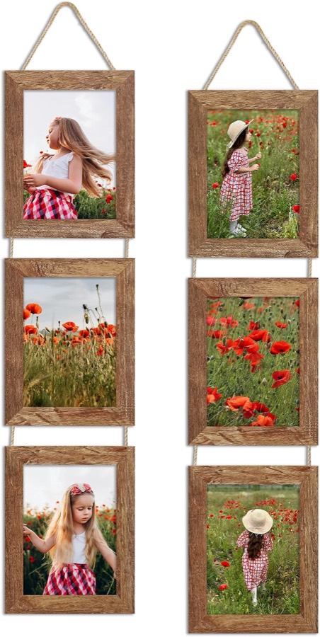
Replace slogan prints with a framed photograph, a piece of minimalist art, or an old mirror. These carry personality without announcing a mood in block capitals. The wall still gets filled, just with something that reads as considered.
5x7 Collage Picture Frames Set of 2, Rustic Wooden Real Glass Vertical Hanging 3 Opening 5 by 7
3. The Gap Above the Cabinets
When upper cabinets stop short of the ceiling, the open shelf above them becomes a problem. The gap will collect dust bunnies and other creatures, and it is best not to leave it at all.
The gap is small enough to look like an oversight and large enough to gather grime. It reads as unfinished.
Instead: close it off.
Seal the gap with a nice molding or a flush filler. A flush filler is a flat panel that brings the cabinet face up to the ceiling. Either option removes the dust ledge and squares off the room.
4. The Exposed Refrigerator
A fridge standing on its own, flanked by nothing, leaves the kitchen looking incomplete. A fridge left exposed makes the whole kitchen look unfinished.
The appliance becomes a blunt interruption in the cabinet run. There is no visual transition, just a tall box bolted into a gap.
Instead: enclose both sides.
Box in the refrigerator on both sides, and ask a cabinetmaker to add an end panel that matches the cabinet finish. The fridge then reads as built in rather than parked.
5. Flimsy Temporary Seating
Plastic folding chairs and cheap stools pulled up to the island date a kitchen fast. Flimsy plastic seating ages a room quickly, and temporary seating makes a space feel unfinished.
The problem is that provisional furniture signals the room is not done. Guests read it as a placeholder, because it is.
Instead: wooden stools or cushioned chairs.
A committed set of wooden stools, or chairs with cushions, anchors the kitchen and makes it look intentional. The seating does not need to be expensive, only committed.
COSTWAY 24-inch Counter Height Wooden Swivel Bar Stools Set of 4, Natural
6. Oversized or Glittery Light Fixtures
Lighting is where kitchens most often tip into builder-grade or overwrought. Inappropriately sized fixtures make a kitchen look builder-grade, and pendants scaled too small for the island are a common offender.
A chandelier, meanwhile, can easily overwhelm the space. The fixture draws attention it has not earned. Scale is the issue in both directions.
Instead: right-sized, warm, diffused light.
When space is tight, two larger pendants beat three small ones. Choose restrained fixtures that cast a warm, soft glow over oversized or glittery ones; lighting should support the design rather than fight it.
DIY tip
Drop ceiling lighting is the biggest lighting offender, closing a space in and giving poor-quality light. Add under-cabinet task lighting instead, which can instantly improve the room.
WOBANE Under Cabinet LED Lighting Kit,Dimmable Strip Lights with RF Remote
7. The Cluttered Countertop
A counter buried under appliances, mail, and gadgets undoes every other good decision. A cluttered countertop makes the mind "hungry" to see less. A clear counter is more elegant and easier to use.
The kitchen sees the most activity in the home, so it will also see the most clutter. Managing it is constant work, not a one-time fix.
Instead: edit, and plan storage early.
Declutter right at the planning stage of the design. Don't skimp on storage, and map out drawer and cabinet spaces against what you actually own. The kitchen should be edited, hard.
8. Clashing Colors and Mismatched Materials
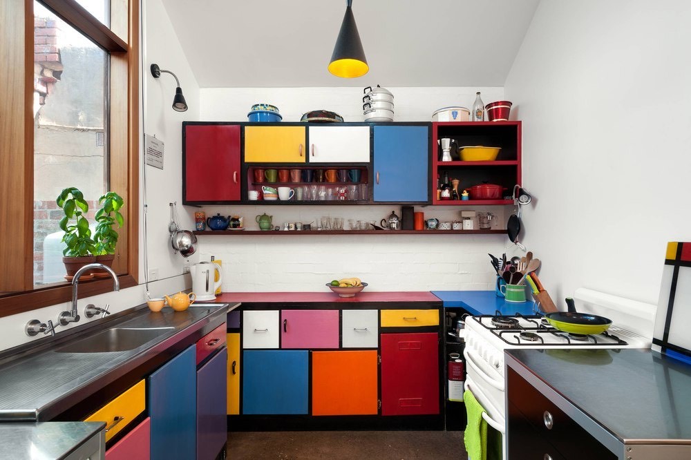
Trend-overloading and chaotically mismatched cabinets, counters, and hardware make a kitchen look tacky.
Hold to a tight palette of about three main colors, because an excess of bright or clashing tones pulls the eye in too many directions.
Color is the common failure point. A colorful kitchen walks a fine line between bold and overwhelming, and pairing two powerhouse shades like navy and aubergine overloads the space.
Instead: one bold color plus natural tones.
Pick one bold color and pair it with natural tones, choosing shades that already exist in nature, like warm chocolate browns, taupes, and soft cream.
Neutral tones read as more timeless, and a soft, singular palette absorbs clutter better.
Budget tip
Clearing the refrigerator front is among the easiest upgrades you can make for free. Move coupons, magnets, and postcards onto a corkboard or behind a pantry door.
DOLLAR BOSS Double-Sided Bulletin Boards with Linen, 16"x12" 1PC Cork Board
Final Thoughts
The through-line across every habit here is restraint. A refined kitchen reads as calm because someone edited it, chose a tight palette, and let the counters breathe.
None of these fixes requires a renovation budget. You can clear a counter, retire the slogan print, and swap folding chairs this week.
The structural items, the cabinet gap and the exposed fridge, are the ones worth planning for next time a cabinetmaker is in the house. Start with whatever is cheapest to change and you will see the room settle.