The 2027 Colors of the Year, Ranked by Livability
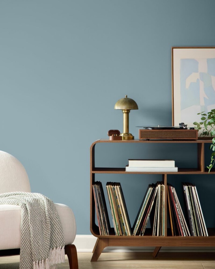
Paint brands stagger their 2027 picks from late summer through December, and the slate already spans mossy olives, moody blues, espresso browns, and muted clay pinks.
That range makes it hard to tell which shades work in a real room and which fight your furniture.
Below, each 2027 Color of the Year revealed to date, with a clear read on how easy each one is to actually live with, plus where to use it.
- 13. Webster Green, Benjamin Moore
1. Celery, Sherwin-Williams
Sherwin-Williams named Celery its 2027 Color of the Year, a pick it shares with its Lowe's-exclusive HGTV Home line. It's a soft yellow-green, a lighter alternative to the deeper hues in the brand's Rewild forecast.
It reads fresh rather than heavy, which makes it forgiving. A soft yellow-green works as a near-neutral in rooms where a deeper green would feel like too much commitment.
What to do instead of a full repaint
Try it on cabinetry or a built-in before committing to walls. The yellow lean warms north-facing rooms that sage can leave flat.
Budget tip
Celery comes as Celery SW 6421 under Sherwin-Williams and as Celery HGSW6421 under HGTV Home by Sherwin-Williams. The Lowe's line gives you the same hue at a lower price point.
2. Grounded, Behr
Behr named Grounded (T27-01) its tenth Color of the Year. It's a mossy olive with a brown cast, sitting between moss and olive.
Behr positions it as distinct from the gray-green sages that have filled so many paint decks for years.
What to look for in the undertone
The brown base keeps it from going gray-green under cool light. It's a newly developed shade, not pulled from the existing range, so expect more depth than typical sage.
3. Artifact, Glidden
Glidden named Artifact (PPG10-16), a warm, smoky blue described as "confidence without the drama and calm without the snooze."
The warmth is what makes this blue livable. It leans more neutral than a true navy, so it layers without dominating.
Where to put it
Glidden suggests walls, cabinetry, ceilings, and exterior details. A color-drenched bedroom or study is the strongest use, and it can refresh a room without a larger renovation.
4. Cottage Door, Valspar
Valspar named Cottage Door (8004-38E), a warm gray-blue the brand calls a reflective midtone neutral that carries undertones both warm and cool.
It captures blue's natural sense of security and trust while serving as a colorful new neutral. That dual undertone is why it behaves like a neutral in most rooms.
Styling tip
Valspar pairs it with Moon Shot (8005-2B), a warm gray, and Apricot Blush (8003-8A), a soft pink. Add light wood tones to keep the scheme from reading cold.
5. Quiet Peace, California Paints
California Paints named Quiet Peace its 2027 pick and calls it the new neutral. It's a deep, moody blue, sitting lighter than a true navy but deeper than a dusty blue.
The depth makes it a statement rather than a background, so it earns its keep in a room you want to feel enclosed rather than one you want to feel bigger.
What to pair it with
California Paints recommends muted browns, creamy beiges, and a pear green to build a restorative, nature-led palette. The warmth in those partners keeps the blue from feeling austere.
6. Vantage Point, Clark+Kensington
Vantage Point (38B-4) is the pick from Ace Hardware's in-house brand, developed with trend-forecasting firm Colour Hive. It's a rich midtone blue with a gently rounded edge.
A softened midtone blue like this is one of the easier bold colors to live with long-term: it carries real character without reading as trend-driven.
What to look for
A softened midtone blue is one of the easier bold colors to live with. It carries more character than a pale wash but won't swallow a small room.
7. Rose Earth, Graham & Brown
The British interiors brand named Rose Earth, a warm, pinkish neutral built from pigments drawn out of Italian clay. It's a muted mineral pink with an earthy tone.
Graham & Brown frames the shade as an easy companion to warm neutrals, soft sage, and cooler tones alike. The mineral quality keeps it from reading sweet, which is what makes a pink wearable at scale.
DIY tip
It's paired with Roselle Grove, a hand-painted floral wallpaper informed by the history of chintz. Use the paper on one wall and carry Rose Earth across the rest to tie the room together.
8. Pueblo, C2 Paint
C2 named Pueblo, the lead color in its Rural Renaissance story. It's an earthy, purple-pink shade of brown, described as a warm, earthy rose.
There is an earthen quality, but also rose. That split personality makes it harder to pin down, and harder to match, than a straight neutral.
What to do instead of guessing partners
Pull from C2's own story: a light olive called Element, a creamy peach called Ambrosia, or a deep brown called Death by Chocolate all share its earthen base.
9. Marle, Little Greene
The luxury paint maker named Marle (335), a softened warm brown from its recently launched collection. It's a mid-tone that blends yellow ochre, black, and red oxide, a fresh take on taupe.
Browns are being embraced and recognised as warm, earthy, and indulgent shades, and Marle is a neutral for those wanting something more dynamic than white and warmer than gray.
Where it works hardest
Little Greene suggests all-over use, drenching a whole room for a cocooning effect. For contrast, bring in plaster pinks, garden greens, or deeper blues.
10. Deep Rooted, Dutch Boy
Dutch Boy named Deep Rooted (311-7DB), a burnished earth tone with a terracotta-leaning cast. It reads rich and grounding, closer to baked clay than to a straight orange.
Terracotta tones demand committed partners. Dutch Boy shows it alongside creamy whites and related oranges, and also against blush pink, bright blue, or a pairing of muted blue-gray and forest green.
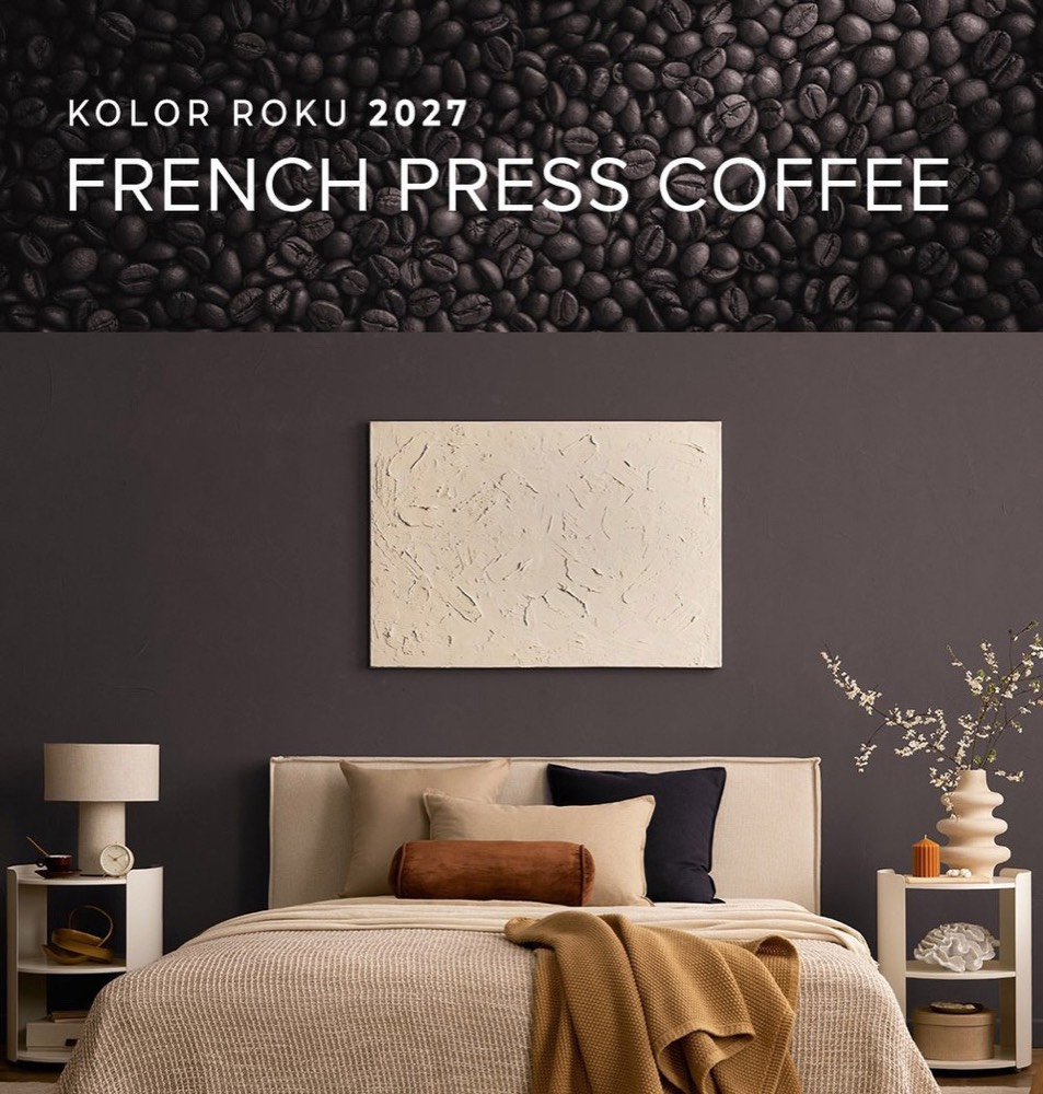
11. French Press Coffee, Dunn-Edwards
Dunn-Edwards named French Press Coffee, a deep brown with soft plum undertones, a shade of espresso. It's a color that reveals itself gradually, its plum undertone emerging as light shifts through the day.
This is the deepest pick on the list, which makes it the least forgiving on full walls. Dunn-Edwards suggests drenching powder rooms, offices, or entries, or using it as architectural contrast on trim and doors.
It pairs well with walnut, aged brass, honed marble, and linen, plus earthy greens, clay tones, and soft creams. Those lighter partners keep a dark drench from closing in.
12. Pickled Oak, Minwax
The wood stain maker named Pickled Oak, a light, subtle neutral with gentle warm undertones, available in semi-transparent and solid finishes. It works by letting the grain beneath it show through rather than covering it.
As a stain rather than a wall paint, it's the easiest to test. Minwax suggests it on cabinetry, thrifted furniture, or heirlooms, and notes it complements Sherwin-Williams' Celery and Dutch Boy's Deep Rooted.
13. Webster Green HC-130, Benjamin Moore
Benjamin Moore named Webster Green HC-130, a green the brand pulled from its historical color collection rather than developing new. It pairs reassuring stability with optimistic energy.
The brand chose it because variations on green showed staying power across past, present, and future trend cycles. A green that doesn't read like the 60s or 80s is rare, and that makes this one of the safer long-term picks.
Benjamin Moore suggests it as a sophisticated accent, in a living room or study, on kitchen cabinetry, or as a front door color. Its composed nature keeps it from dominating a scheme.
It's backed by seven curated partners, including the off-white White Down OC-131, the pale Nelson Blue CW-635, and the golden Shakespeare Tan 228. Layer the pales to let the green sit as the anchor.
Final Thoughts
The easiest 2027 colors to live with are the softened midtones: Celery, Cottage Door, Vantage Point, and Rose Earth all behave like neutrals while carrying character.
The espresso browns and terracotta shades reward a committed, drenched room more than a cautious accent wall. Test any of them on cabinetry or trim first, and remember Pantone has yet to weigh in.