The Case for Charcoal Blue Kitchen Cabinets in 2026
White kitchens had a long run, and plenty of homeowners are ready for something with more backbone. The shade stepping in isn't a loud one.
White kitchens had a long run, and plenty of homeowners are ready for something with more backbone.
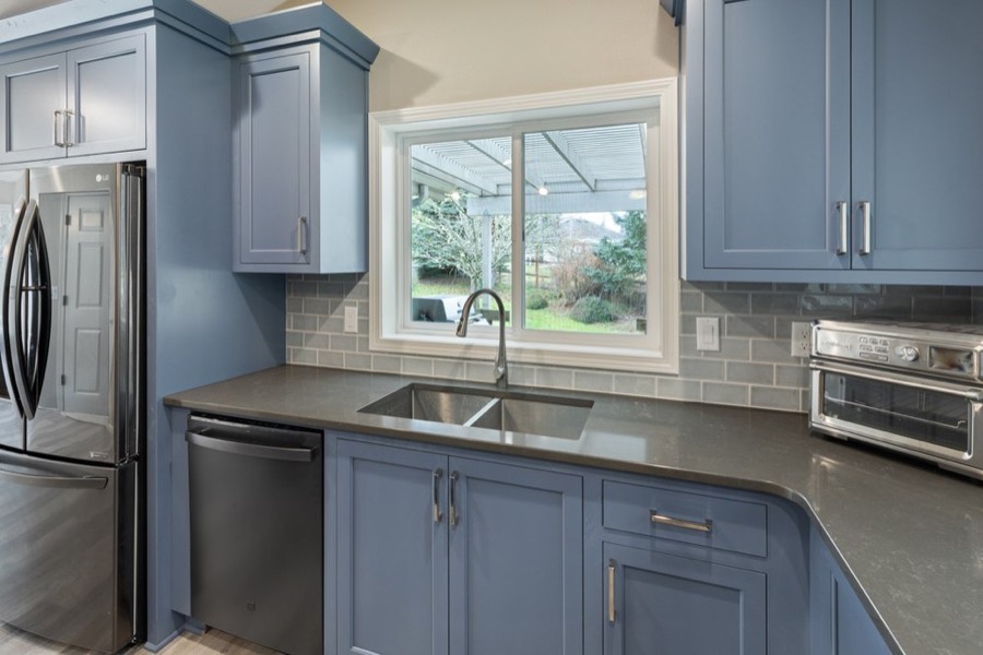
The shade stepping in isn't a loud one. It's a deep charcoal blue, almost the color of dark cornflower, and it's turning up on cabinet runs everywhere.
What makes it work is restraint. This blue reads grounded and sophisticated, not bright or nautical, which is exactly why it lands in a room you cook in every day.
1. What "Charcoal Blue" Actually Means
Blue cabinetry isn't new, but the version taking over now is a different animal than the navy everyone reached for a few years back.
What to Look For
The blues trending in 2026 are dark cornflower shades that edge almost into charcoal, a clear break from the saturated navy that defined kitchens for years.
Tracy Morris, principal of Tracy Morris Design, describes charcoal blue as a sophisticated alternative to traditional navy or gray, combining the calm of blue with the depth of a darker tone.
Kelly Emerson, a senior designer at Aidan Design, calls blue-blacks a great compromise for anyone caught between blue greens and deep blacks.
The through-line is depth. A clean, bright blue reads trendy. A blue muddied down toward charcoal reads permanent.
DIY Tip
If you're testing samples, put the swatch next to a piece of black granite and a slab of pale marble. The blue should hold its own against the dark stone and still read blue, not gray, against the light.
2. Why Homeowners Are Making the Switch
Charcoal blue is winning converts for a simple reason: it feels current and classic at once.
Why It Works
Cool grays were a staple on walls and cabinets for years, and homeowners are now after something with more character. Charcoal blue is climbing because it grounds a space while still making a stylish statement.
The color feels both current and classic, giving a kitchen visual weight and modern elegance without the obvious trendiness of a brighter hue.
That's the real draw. A charcoal blue gives you color commitment without the fear of dating your kitchen the moment the trend cools.
The color reads as nostalgic and contemporary together, which is why it sits so comfortably in a range of kitchens.
3. The Materials That Make It Sing
A charcoal blue needs the right company. Pair it wrong and it goes flat or reads as plain gray.
What to Pair It With
Charcoal blue works best against light and warm materials that give it room to breathe. The color shines when paired with light countertops or warm metallic accents.
Aged or unlacquered brass hardware (brass left without its protective lacquer so it patinas over time), pale stone counters, and creamy walls all set off the depth of the blue instead of fighting it.
Stark, blue-white trim works against you here, since it echoes the cool in the cabinets and flattens everything. A creamier white keeps the palette balanced.
If your counters or backsplash already lean cool, test the blue on a lower cabinet run or island first rather than committing the whole kitchen to it.
Styling Tip
A charcoal blue loves warm metals over cool ones. If your existing hardware is polished nickel or chrome, swap it for brass before you judge the paint color, since the cool metal is probably what's making the blue look gray.
4. Charcoal Blue as Part of a Two-Tone Scheme
You don't have to drown the whole room in blue. One of the strongest ways to use it is on a single run.
How to Execute It
Nancy Davilman, principal designer at ND Interiors, says the two-toned cabinet trend stays strong through 2026.
One approach pairs natural wood cabinets or open shelves up top with a bold, powerful shade along the lower cabinets. A contrasting island is another entry point, emphasizing the island as a focal point and setting up statement pendants above it.
Put the charcoal blue on the bottom. Lower cabinets ground a room, and a deep blue down low with lighter uppers reads balanced instead of heavy. It also keeps sightlines open in a smaller kitchen.
5. Where Charcoal Blue Fits in the Wider Palette Shift
Charcoal blue isn't the only color having a moment, and knowing the neighbors helps you place it.
The Broader Context
The move toward charcoal blue is part of a broader retreat from crisp, cool palettes that ruled kitchens for a decade.
The 2026 cabinet palette runs toward warm neutrals, nature-inspired greens, stained woods, and shades of brown. Greige and mushroom are climbing because they add personality and depth while keeping a kitchen feeling organic.
Mushroom is the choice for people who want warmth without going dark. Charcoal blue sits on the bolder end. If mushroom feels too safe and a jewel tone feels too risky, charcoal blue is the darker option that still holds up.
6. Prepping Cabinets for Paint
A rich color on badly prepped cabinets looks worse than plain wood. The surface work decides the outcome.
How to Prep
When stripping isn't practical, a thorough cleaning followed by light sanding is usually enough to ready the surface.
SKIL Corded Multi-Function Detail Sander with Micro-Filter Dust Box 3 Additional Attachments & 12pc
But if the existing finish is a clear coat, strip it down to bare wood first, since stripping heads off the adhesion problem that can develop between the old finish and your fresh paint.
Know when paint won't save a cabinet. Even the best work can't rescue cabinets that have worn out with age, so check for sagging particleboard shelves, peeling veneer, and loose hanging rails before you spend a weekend on them.
Budget Tip
Painting cabinets yourself runs roughly $200 in materials on top of a weekend or so of labor. Compare that to new cabinets for a 10-by-12 kitchen, which This Old House notes can easily top $5,000.
7. Paint, Brushes, and Finish
The finish you choose matters as much as the color in a room that takes daily abuse.
What to Use
Oil and latex each deliver a solid finish on cabinets. A lot of pros still reach for oil-based topcoats, since they cure into a harder, smoother film, but latex has improved steadily, dries fast, and cleans up with water.
A 100% acrylic latex sticks and wears better than a vinyl acrylic formulation. Apply latex with a synthetic bristle brush and oil with a natural-bristle one.
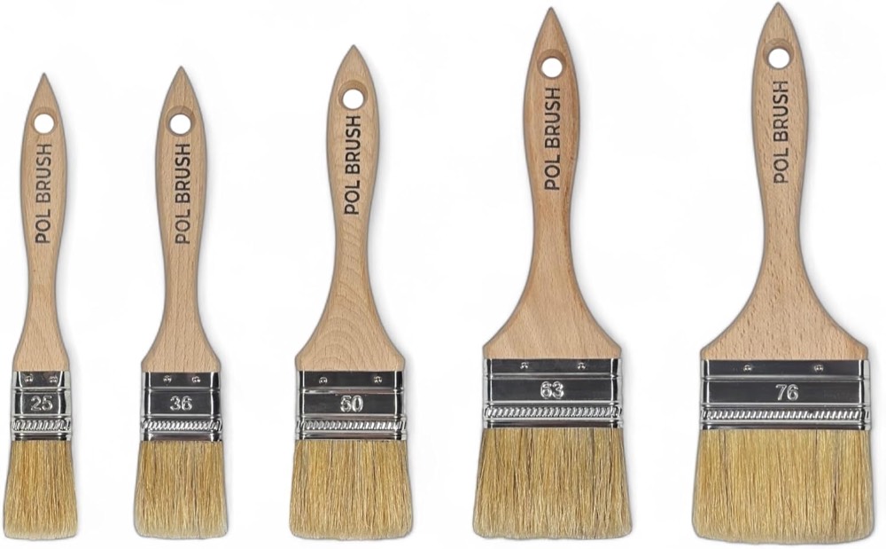
Pro Grade Paint Brushes, Paint Brush Set for Walls, Trim & Stain, 5-Piece
Set of 5 1, 1.5, 2, 2.5, 3 Inch Flat Paint Brushes - High European Quality - Natural Bristles
Go higher on sheen than you think. Higher sheen means a more durable finish, and high-gloss outlasts satin in a busy kitchen.
For flat panels, reach for a 3- to 4-inch square brush; for molded doors, an angled 2½- or 3-inch brush gets into corners, covering door frames in a single pass.
Pro Grade Paint Brushes, Flat & Angled Paint Brush Set, Walls & Trim, 2 Pc
One caution with latex: it takes up to three weeks to fully cure and stays vulnerable during that window. Go easy on fresh doors for the first few weeks.
Final Thoughts
Charcoal blue's appeal comes down to balance. It carries real color without the obviousness of a bright blue, and it plays well with the light stone, brass, and creamy walls already moving into kitchens.
If the full commitment feels like a lot, there's a low-stakes way in. A single charcoal blue run on the lower cabinets or the island, with the uppers kept light, gets you the color without the weight. Brass hardware in place of chrome settles any doubt about how the blue reads, and sound cabinet boxes underneath are what make the whole project worth a weekend.
That gives you a kitchen with character you won't be repainting in three years.